ReadMe: A UX Email System
Designing a Modular Email System for Multi-Brand Communication.
About the Project
This UX design project was a bit different from a typical interface or product design. Instead of designing an app or website, I focused on the structure and visual logic of a corporate email newsletter.
Working alongside another designer, I developed a modular layout system composed of reusable content blocks to help the internal marketing team easily create and adapt newsletters across multiple brands. My goal was to bring UX principles into email communication: clarity, consistency, scalability, and user focus.
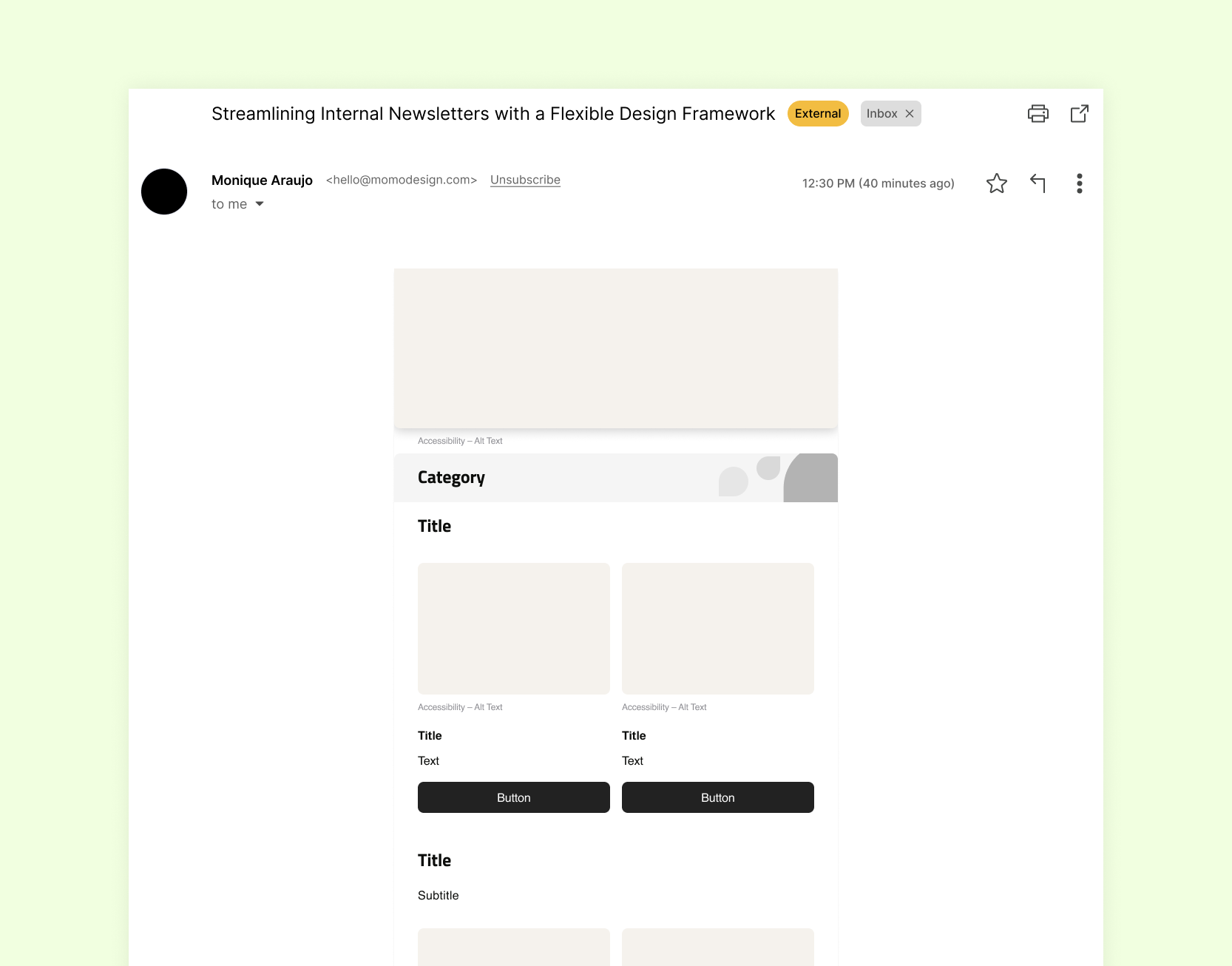
Rather than producing a single static design, I created a flexible framework that could support different types of content while maintaining a cohesive structure, visual identity, and brand voice.
👩🏻💻 My Role
UX/UI Design
Research, wireframes, design system, developer handoff
🛠 Tools
Figma
⏱ Timeline
2 weeks
Challenge
The primary challenge was ensuring that each brand's identity was subtly represented while keeping the newsletters uniform in structure and easy to navigate. Additionally, the design needed to enhance readability and engagement among employees.
Research
I reviewed past newsletters and spoke with the communications team to understand their main challenges. Based on that, I researched best practices in email marketing and UX design to guide my decisions around layout, clarity, and usability.
A key challenge was aligning the stakeholder with newsletter principles: they initially wanted a large number of content blocks, but I used research data to show that too many blocks would make the newsletter overwhelming and less engaging. This approach helped me guide them toward a balanced, user-focused layout that enhanced readability and maintained employee interest.
Pain Points Identified
The newsletters often included too much information, making them visually dense and hard to scan. As a result, many employees would overlook important content or stop reading altogether.
Design Decisions
I chose a modular, block-based structure to make it easier for the team to assemble each newsletter according to the content available that month. I designed this flexible approach so they could add, remove, or rearrange sections without compromising the visual consistency or usability of the layout.

Solution
I designed a modular email layout with clearly defined content blocks such as headers, news highlights, employee spotlight, and events. I made each block reusable and rearrangeable, providing flexibility for different content each month.
Since each brand has its own colors and fonts, I focused this case study on the wireframe structure rather than the final visual styles. I also delivered the content blocks and the design system documentation to the developer, who implemented them in the company’s newsletter platform, E-goi.

What I Learned
✦ UX design principles can (and should) be applied beyond traditional interfaces, including communication tools like email marketing.
✦ Designing for email requires attention to technical constraints, such as rendering differences between email clients and mobile responsiveness.
✦ Creating a modular system helped bridge the gap between design and non-designer users, making the process more scalable and efficient.
✦ Documentation and clear design guidelines are just as important as the visual design, especially when the solution needs to be reused by others.
✦ Thank you for reading!
Feel free to contact me
moniq.mca@gmail.com