Redesign of a Pharmaceutical B2B Ordering Platform
Enhancing the online buying experience for pharmacies nationwide.
Challenge
A leading pharmaceutical distributor in Portugal, operating as a cooperative, needed to modernize their institutional site and B2B ordering platform used daily by hundreds of pharmacies.
With five automated logistics centers, they required a digital experience that matched their efficiency and reliability.
In this case study, we’ll focus on the redesign of the B2B platform, essential for daily pharmacy orders.
👩🏻💻 My Role
UX/UI Design
Wireframes and UI design, design system, prototyping, testing, and developer handoff
🛠 Tools
Figma
Miro, Whimsical, Maze
⏱️ Timeline
6 months
Research & Discovery
The client initially reported that pharmacy partners were frequently calling account managers or support lines to request information that was already available on the portal. This behavior indicated that users were either unaware of where to find the information or found the platform too confusing to navigate.
To better understand the platform’s pain points and user needs, I used insights from a previous research study involving 19 interviews. 10 with internal stakeholders (Voice of Business) and 9 with end users (Voice of Clients), all regular portal users. The study uncovered 485 insights that informed the redesign.
Based on this research, I identified key findings from both perspectives, which are outlined below.
Key Findings - Voice of Business
✦ The Voice of Business revealed a lack of visible documentation on the portal, as well as insufficient information about products, pricing, and purchase profitability.
✦ They also reported insufficient visibility into the status and progress of orders.
Key Findings - Voice of Costumer
✦ While overall usability was considered acceptable, the interface was described as outdated, visually heavy, and occasionally difficult to interpret.
✦ Users expressed frustration with the platform’s navigation, citing that key information was either buried or inconsistently organized, making it hard to locate.
✦ Many participants admitted they preferred contacting customer support for answers, as the platform felt confusing and not intuitive enough to use independently.
✦ While the portal is primarily used on desktop, several users highlighted the need for a mobile-optimized experience for added convenience.
Based on these insights, two personas were defined to guide design decisions and platform improvements.
Additional Methodology:
To deepen the understanding of user experience and pain points, a User Journey Mapping workshop was conducted. This collaborative session helped visualize key interactions and identify opportunities for improvement, guiding subsequent design decisions.

Images of the previous platform

Wireframes
Before starting to design the wireframes, I conducted a workshop with stakeholders to understand their pain points and co-create solutions for the most critical parts of the platform. With those insights in mind, I mapped out the user flows to guide the structure of the upcoming wireframes.
The wireframing stage also followed a collaborative process with stakeholders, with weekly meetings to review the new flows and validate the information on each screen, ensuring we reached the ideal balance between business requirements and user experience.
The wireframes were then tested with users to ensure their main challenges were addressed and to validate the proposed solutions.

Usability test discoverys
Overall perception of the new portal was positive.
✦ Users found it intuitive, fast, and aligned with their needs.
✦ They also noted similarities with the current portal and other familiar tools, which contributed to a smoother experience.
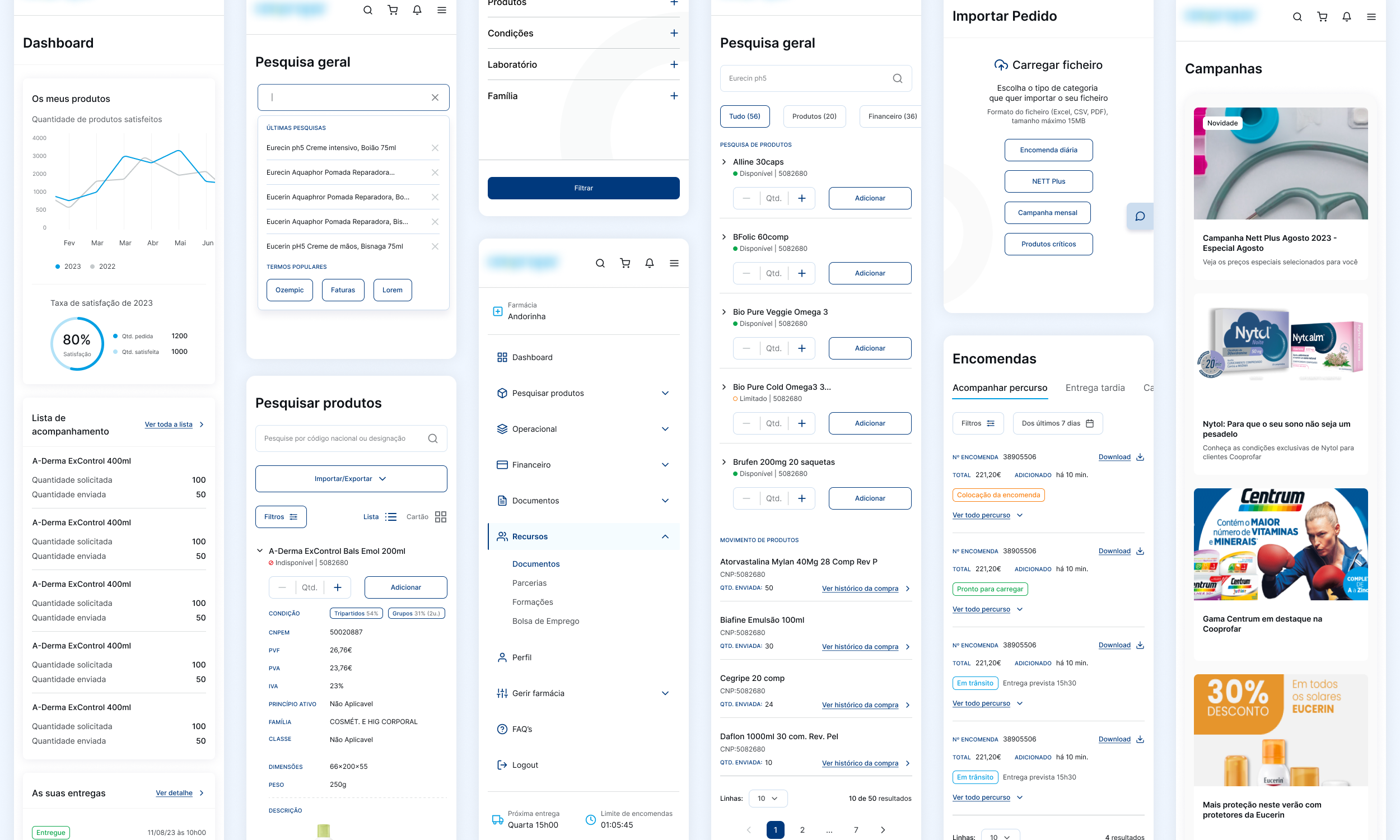
However, some negative points were raised. For exemple, the product display: the initial card-based layout, limited the number of products visible on screen. Users expressed a preference for a list view to scan more items at once.
To address this, an option was added for users to choose their preferred way of viewing products, allowing them to switch between card and list layouts.

UI Design
The UI design was inspired by a minimalist approach, focusing on what matters most: providing essential information for users to manage their purchases with the cooperative while simplifying stock management. To inform the design, I conducted a benchmark of competitor platforms, incorporated insights from stakeholder interviews, and analyzed user research to ensure the interface met real user needs.


The menu was redesigned to make it easier and more intuitive for users to find documents and key information, helping to reduce the number of support calls to the customer service center.

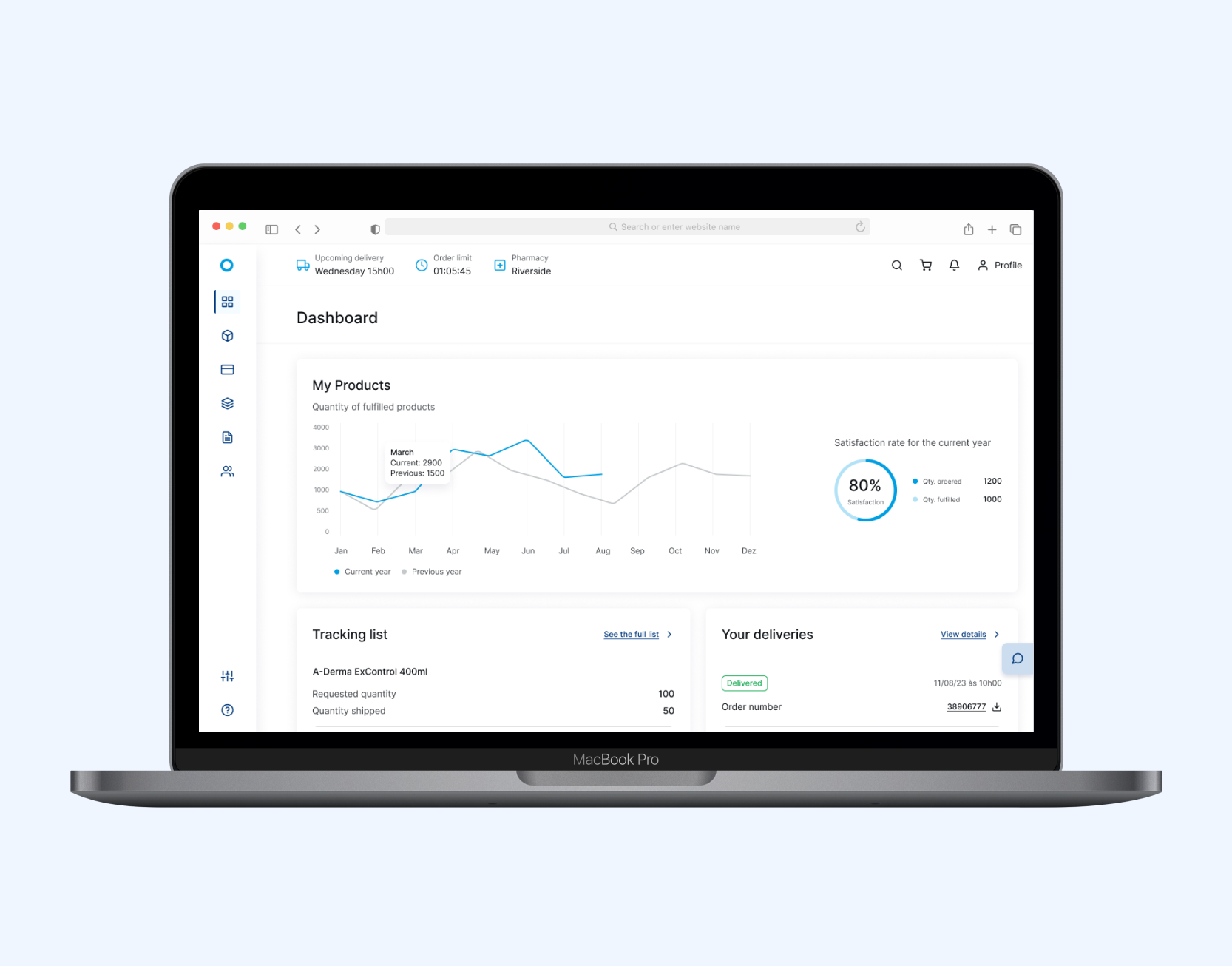
An additional dashboard was added to the financial area to help pharmacies manage their accounts more easily and efficiently.
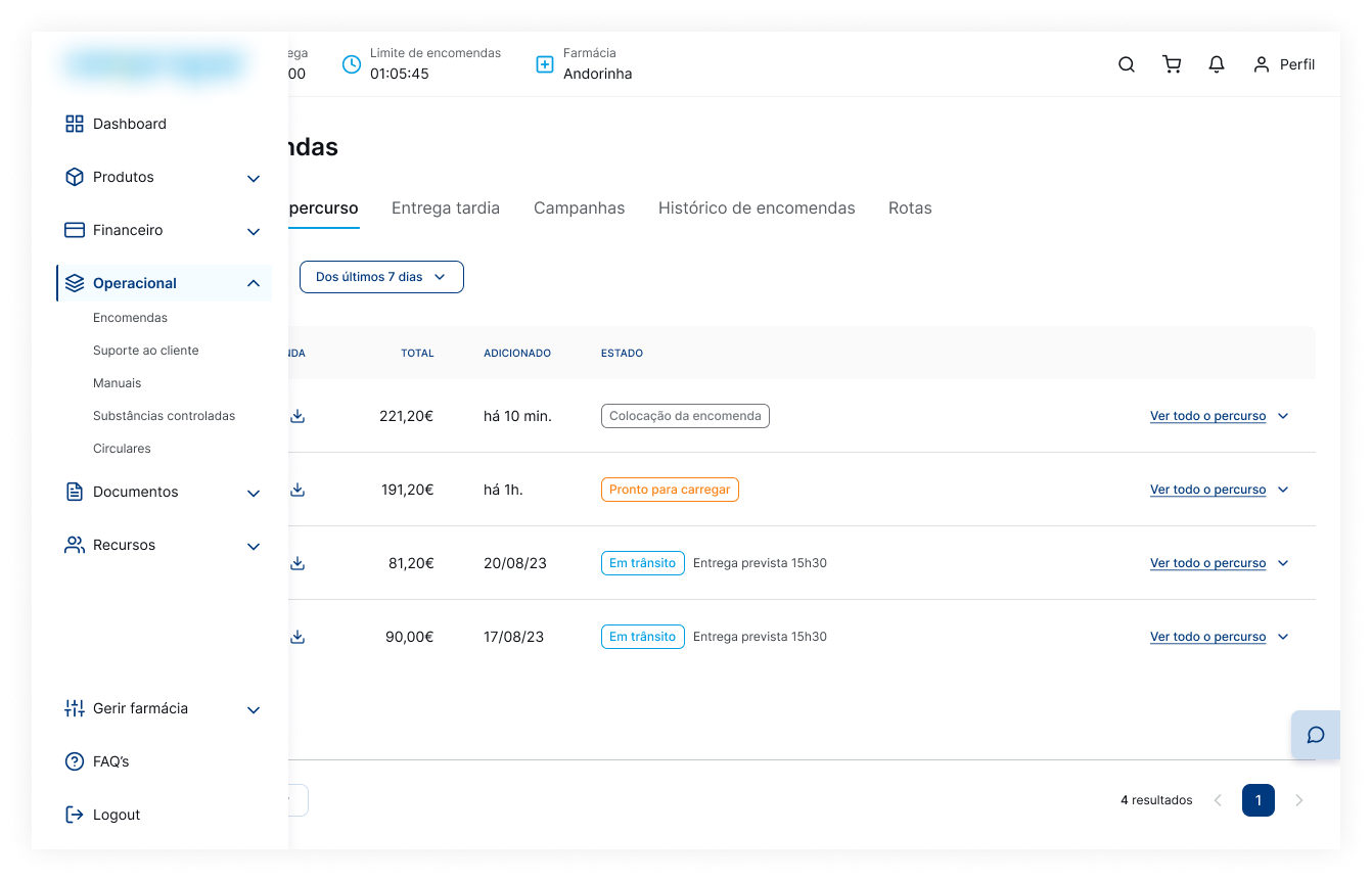

The orders page was redesigned to provide greater transparency on order status, using clear identification tags to help users quickly understand each order’s progress.
Mobile UI
Key Learnings
Understanding user needs early in the process was essential to guide meaningful improvements. The changes made, including clearer order tracking, better navigation, and a more engaging user interface, helped create a platform that is not only more functional but also truly connected to how users want to work and succeed.